Showing posts with label color studies. Show all posts

Monday, May 4, 2020

Deep Thoughts

"Deep Thoughts"        Image:  8" x 10"
Watercolor

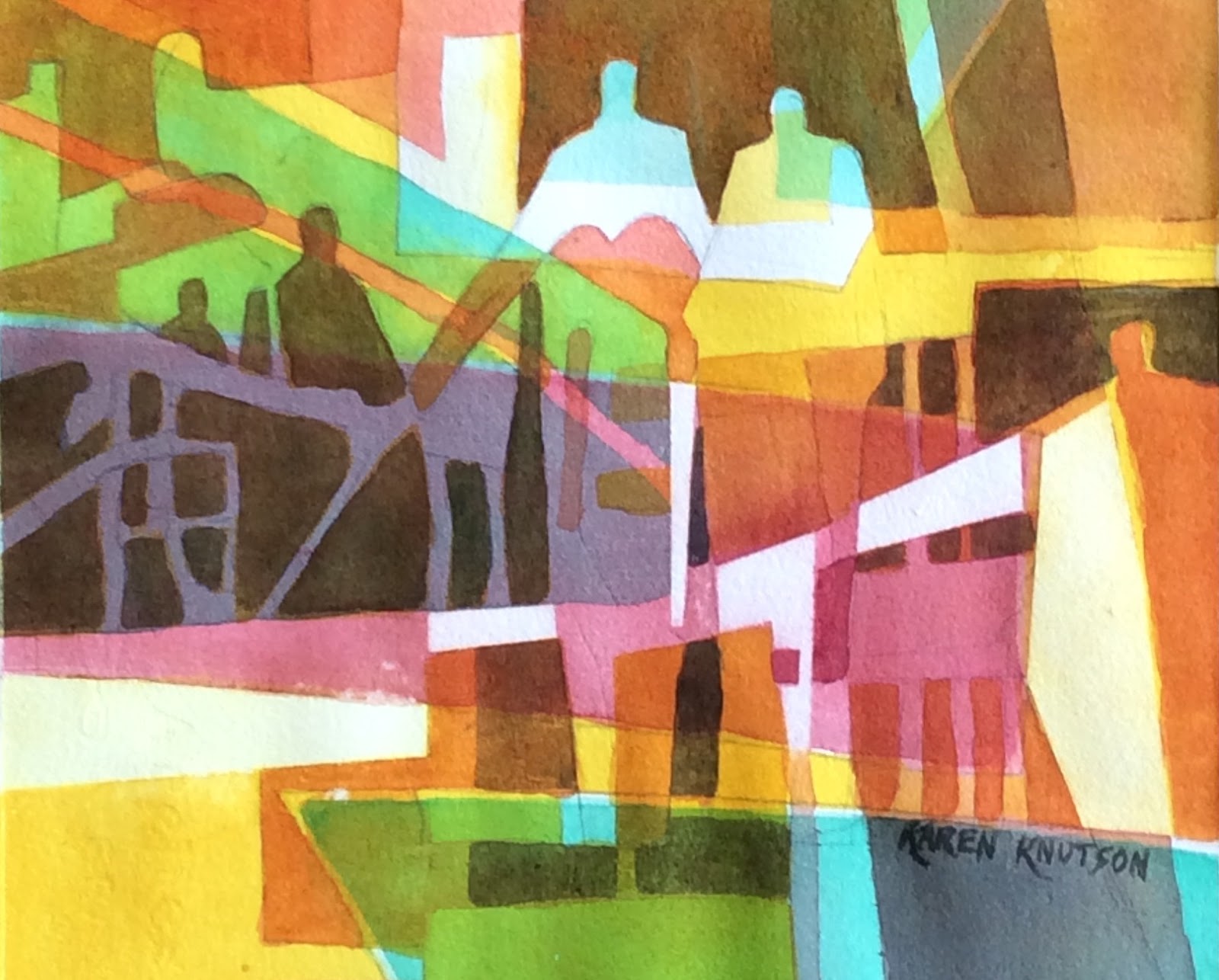
This painting is pretty deep.  The figures in the center are my husband and I, holding my broken heart.  The dark figures on the left are my mom and the other residents in the memory care unit where she is residing now, (a 10 hour drive away) with no visitors allowed.  The figure on the right depicts the Corona Virus and how it is stealing our time with our loved ones.  Much love to all of you as we all struggle with this horrible time in our lives.  I'm very thankful to have a patient husband, loving friends and family, and my artwork to help work out my frustrations. Stay safe....

So, below are the steps to this painting, that I used only 3 colors:  New Gamboge, Winsor green (blue shade), and alizarin crimson.  Very unusual colors for me.  I scrubbed out some lights at the end, using masking tape to block it off.  I also cropped so that it would be better design.

Monday, April 13, 2020

Good Days Ahead!

Our Easter Sunday was cold and snowing all day.  We ended up getting about 5 inches of snow.  But today, we woke up to sunny skies, and it honestly was a beautiful scene.  Our lake is the most beautiful shade of Antwerp blue with the sky being cerulean blue, and the shadows on the snow are so striking!   The moral of this story is-  sometimes, we have to have some gloomy days, so we will appreciate the beautiful ones!  It got me to thinking about our present situation and how dismal it seems, but we have to hold onto hope that tomorrow will be a better day!  So, here's hoping you are having a great day, and maybe I can give you some inspiration to keep painting!
Easter weather on the left.    One day later, on the right!

I thought I would take photos as I progressed through an illusionary painting.  Hope it will inspire you to give this process a try.  I only used 3 colors throughout this painting.   I used quinacridone gold (DS),  Red Rose Deep (DaVinci) and Antwerp Blue (WN).  Watch for future workshops if you want more instruction.  This process is called Illusionary Painting and it is pure watercolor.  This image is 7.5" x 7.5".

Monday, March 30, 2020

New painting, "Hope"

"Hope"
10" x 10" watercolor   $125
In this time of social distancing, I think we all need hope.  I've really had to dig deep to get myself out of the blues, and I know many of you might be in the same boat.  Thankfully, I'm back to feeling good again, mentally.  If you still are struggling, my advice is to reach out to friends doing FaceTime calls or I discovered a Zoom app that is fantastic for big groups of people.  The other thing that I'm doing is taking one or 2 walks per day, trying to schedule them when the sun is the brightest. Vitamin D is so healthy for us!  But I really believe that the thing that made the difference for me, was exercising to a Facebook site, Planet Fitness, with the trainer, Erica.  I can't keep up with her at this time, but I'm hopeful that each time, I will get better and stronger.  It's free, and has a connection with TV show, The Biggest Loser.  Who knows?  Maybe I will lose a few pounds too, but the main reason I'm committing to this is that it helps my mental health.
Now, let's talk about my painting.  This is a watercolor color study , using only 3 colors: WN raw umber, Hobein Pyrole Orange, and WN Antwerp.   The process is shown if you look back at my blog on Sept. 1, 2018.  Or you can type in "color studies" in the search box at the top of my blog and that will bring you to all posts that involve color studies.  Adding words makes it really difficult and I fly by the seat of my pants for that.  Have a great week everyone, and be safe; stay home!
Tuesday, December 18, 2018

5 Minute Landscapes

"Golden Sunset"   5" x 7" image.
Matted:  8" x 10"   $45
Every now and then, it's just fun to do really quick paintings.  These little gems will test your skills at timing in watercolor.  I start with a 5" x 7" watercolor paper.  Then I wet both sides of the paper several times, so it is very wet.  Then lightly sponge off the right side and begin.   Using a bright color (red/orange), I paint the sky and the water, leaving a big white shape.  Then I pick it's complementary color and smear that into the first color to create a grey color and then have the complementary color (green) on the upper left and lower left corners.  Switching to a 1/2 " flat brush, I double load the two complementary colors in a dry brush mixture to make the tree masses.  I do NOT mix the color on the palette or it would be too wet.  Pull down the colors to create the reflections.  Use a thirsty brush to wipe out the water line.  Then wipe out a ripple in the water.  You can put more detail on the trees, using a small round brush that is double loaded with the 2 colors.  That's how I was able to get the points on the top of the trees.  You do all this is only 5 minutes!  It's fun to do color studies using this process.  Odd colors are usually my favorites.

Saturday, September 1, 2018

Color Studies- great warm-ups!

Pick ONLY 3 colors and write them on the back of your 5" x 7" watercolor paper.  This Color Study started by making 3 shapes and painting each shape a different color.


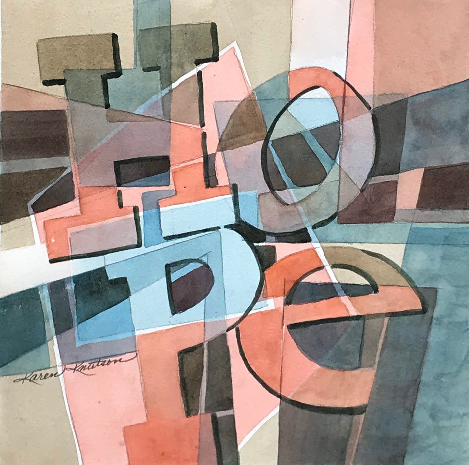
Draw 3 shapes that don’t overlap.  You should have 4 areas now.  Choose 3 colors.  Leave one of the shapes white and color each of the others a separate color. Leave a tiny border between the colors so they won’t bleed into each other.  Repeat this process until you get lots of different layers and colors created by overlapping colors.  I add black at the very end to "lace" the viewer's eye through the painting.  I do these instead of color graphs.  So much more fun!  

Saturday, January 17, 2015

Day 18 of 30 Paintings in 30 Days!

"On Top of the World"            11" x 11"                $145
Acrylic painting
I love the song, "I'm on top of the World", so this time, I started with the title and then painted a painting to go with it.  Click on the link, and you can hear it too!  Again, I started with a wild under painting.  See photo below.  I highly recommend starting this way, because it takes away that initial fear of facing blank white paper.  Plus, it unifies your painting.  See Day 3 to read detailed instructions of this process.  I looked through my one year of color studies, and found one that would lend itself well to this idea of the globe, even though the colors were all wrong.  It was a starting point for a good design. I just used part of it, and worked the girl and the globe into it's design.  I drew the value sketch next, and then started painting the midtones first, to establish a unifying value.  I didn't know that her hair would be blue.  I could have made her a blonde, but it looked good as the under painting color and it related to my color scheme, so I left it that way.  Simplification is always good.  I do feel so lucky in this life, and do feel "on top of the world".

Monday, June 30, 2014

Warm-ups to kick Artist's Block

This is a "wire drawing" of an eye, done while I was up at the North Shore, relaxing.  Whenever I have art blocks, I have 3 or 4 tricks to get myself back into the mood.  One of these involves sketching anything with a pencil.  Then I use an ultrafine marker to connect all the lines, and finally, I add thicker lines with a fine marker.  Before you know it, an hour has passed, and now you'll be ready to paint the moon!  Another trick is to paint color studies, using only 3 colors, and starting with only 4 shapes.This color study started with a blue square surrounded by yellow.  In the middle of the blue square was a yellow olive shape with a red center.  Do you see them? I used manganese blue, cadmium yellow, and red rose deep.  At the very end, I allowed myself a mixture of alizarin crimson and winsor green for the black colors. Now you have 2 tricks to keep that mean old artist's block at bay!  Good luck!


LinkWithin

Related Posts Plugin for WordPress, Blogger...